

LOGO
Letícia Lamar
PT-BR
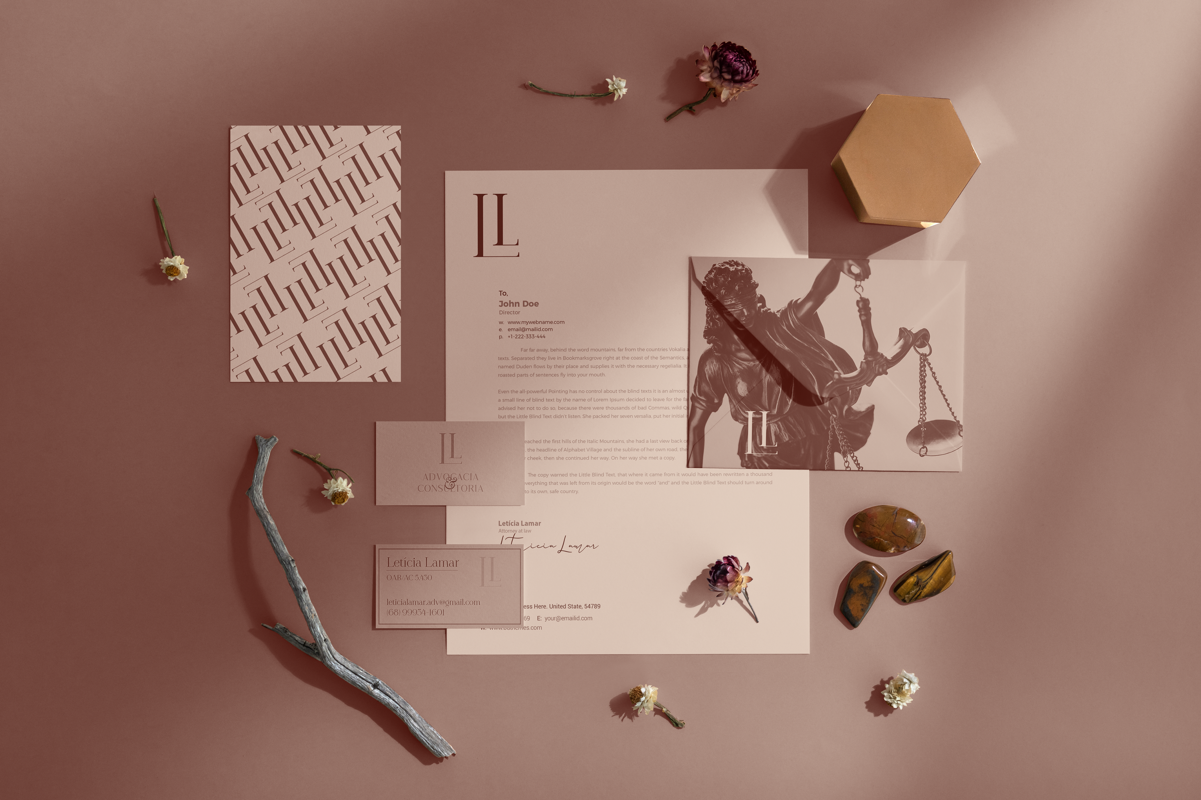
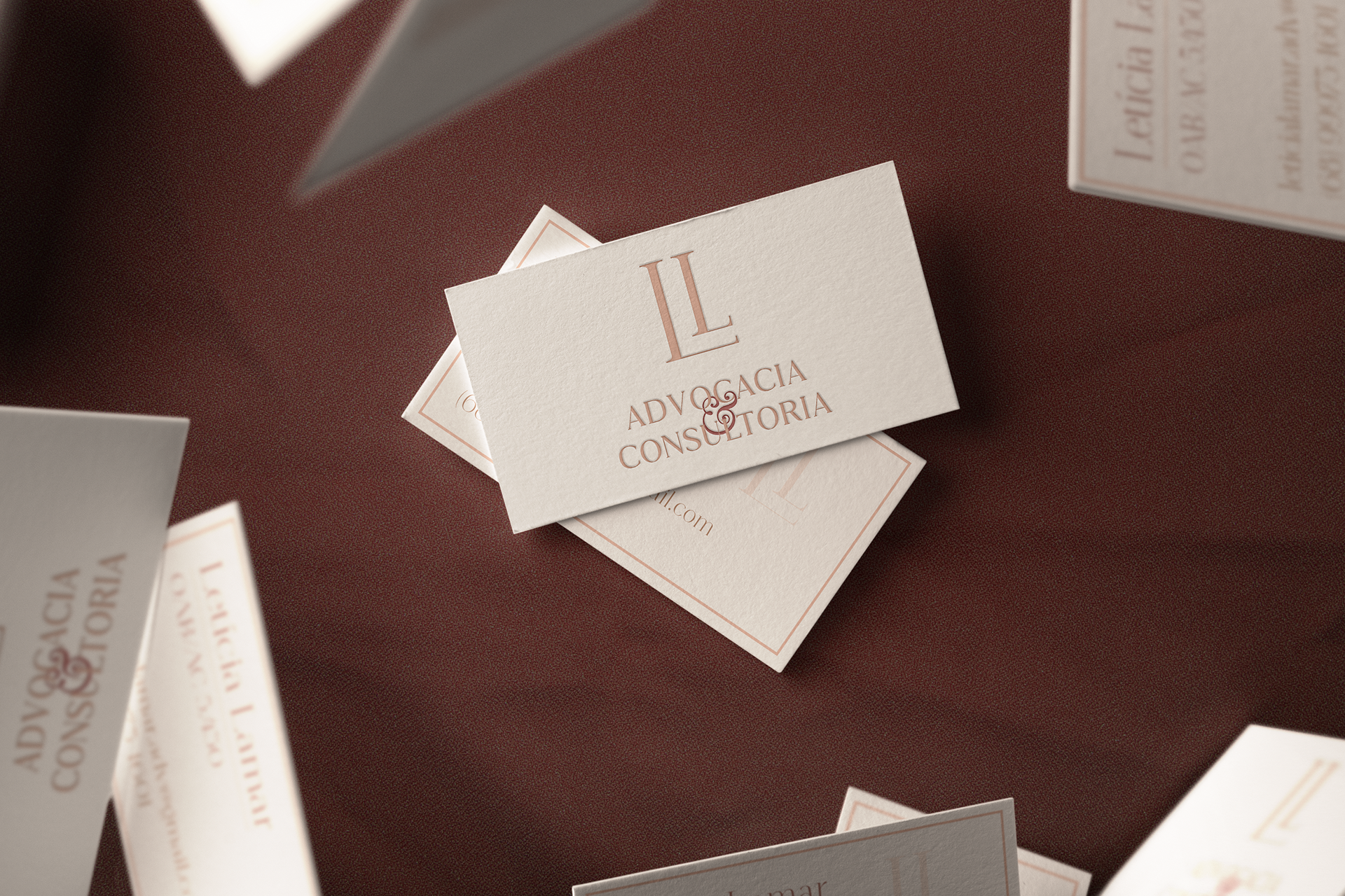
Durante o briefing, a cliente destacou o desejo por uma identidade visual simples, que transmitisse seriedade, força e juventude, sem abrir mão da feminilidade. A partir dessa premissa, surgiu a oportunidade de unir suas iniciais em um símbolo harmonioso: dois "Ls" que se complementam, com o primeiro servindo como base sólida para o segundo.
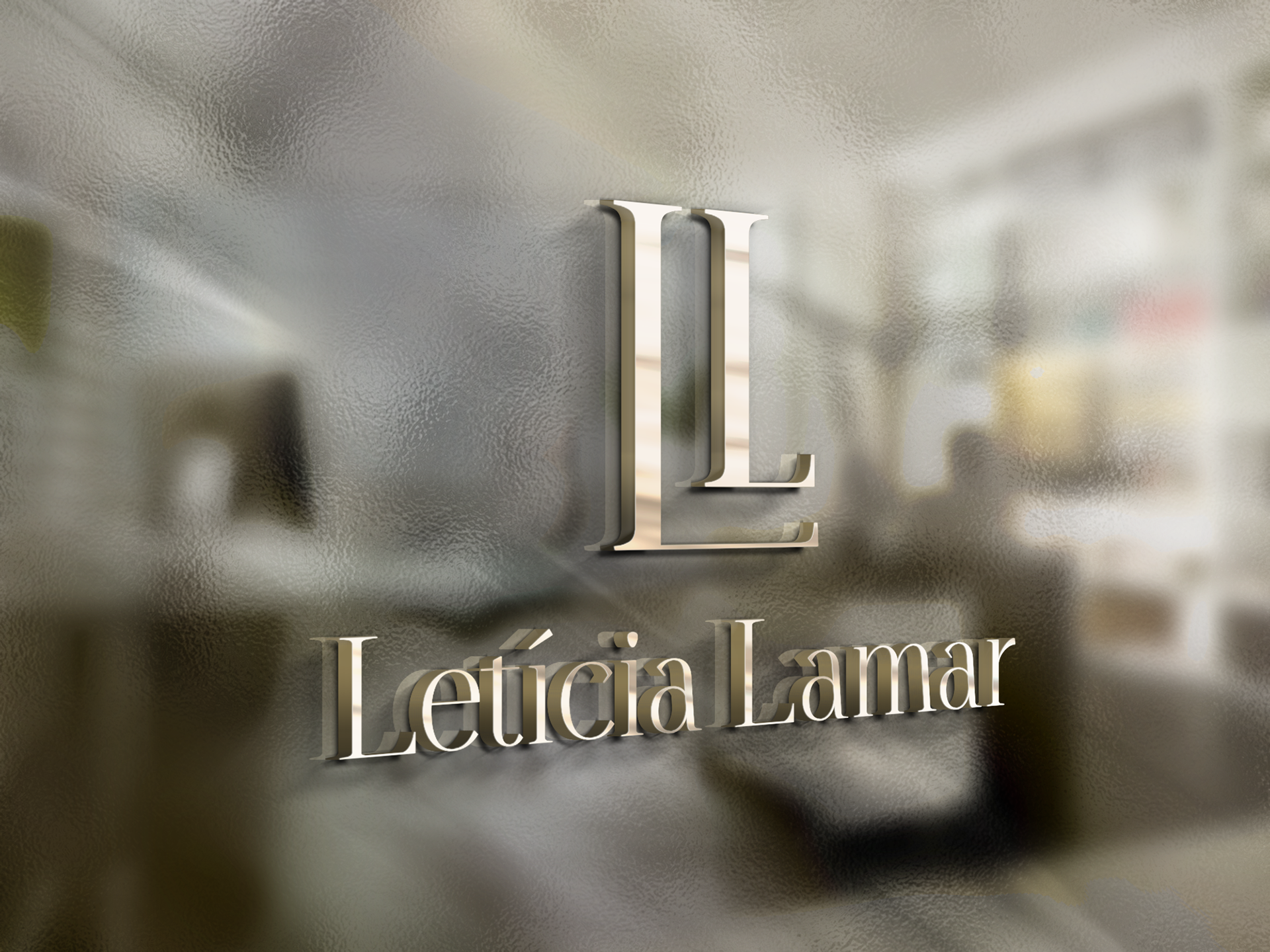
No processo criativo, mergulhei em livros e referências de décadas passadas para explorar a tipografia e a melhor forma de transformar a letra "L" em um símbolo marcante e elegante.
EN-US
During the briefing, the client emphasized her desire for a simple yet impactful visual identity—one that conveyed professionalism, strength, and youthfulness while preserving her femininity. This led to the creative opportunity of merging her initials into a harmonious symbol: two "Ls" complementing each other, with the first "L" serving as a solid foundation for the second.
Throughout the design process, I revisited vintage books and archival references to explore typography and find the most compelling way to transform the letter "L" into an elegant and memorable emblem.